
Possibly, if the project benefits from a light content-first foundation. Treat it as a starting system, not a finished brand. A real business site still needs content architecture, custom patterns, performance testing and conversion design.
Why the name change matters
WordPress default themes have traditionally followed the calendar. Ipsum moves away from that rhythm. A default theme can now change when the design needs to change, rather than because a new year arrived.
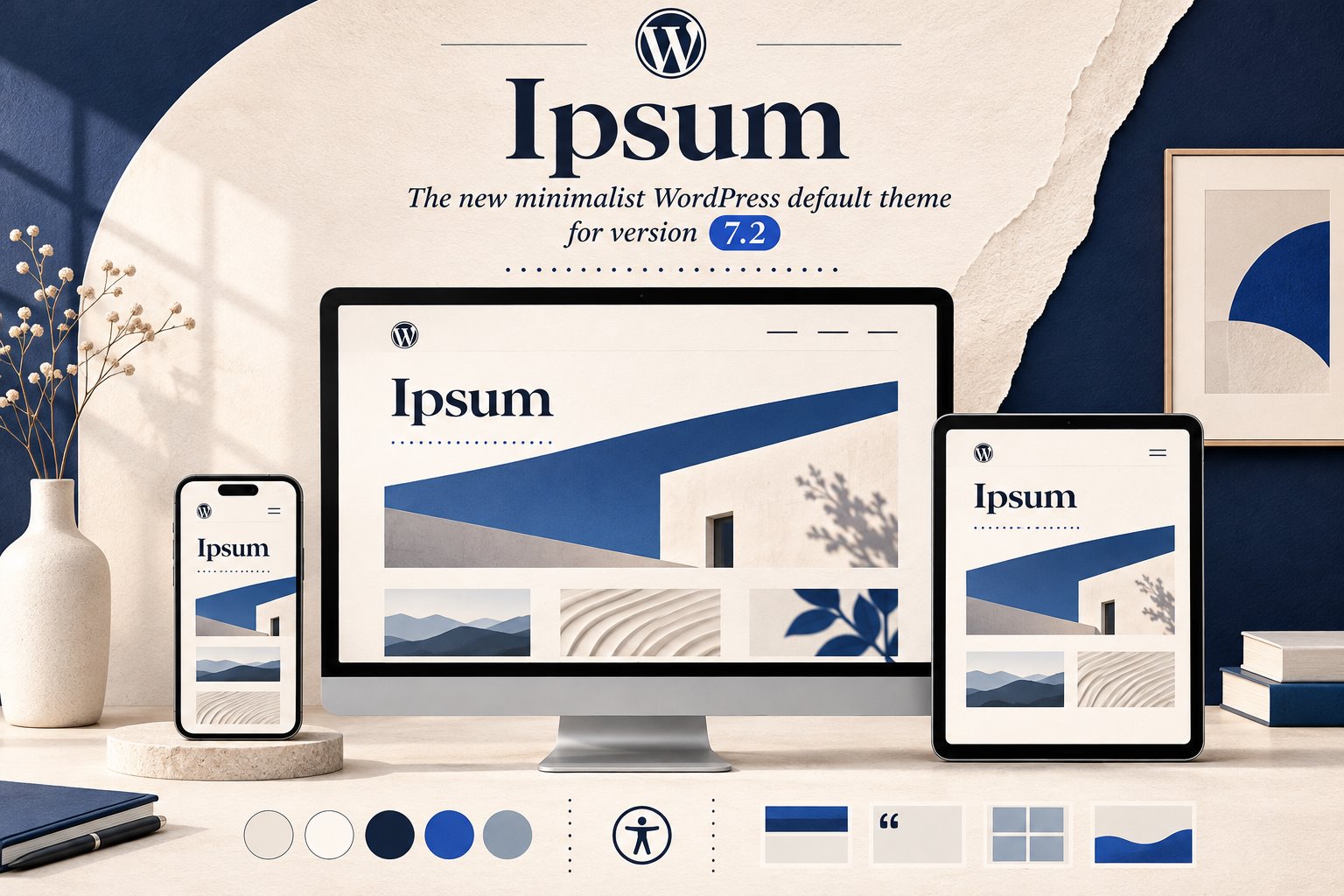
The name comes from lorem ipsum, but the theme is not intended to celebrate placeholder content. Its quiet layout puts the writer, images and typography ahead of decorative chrome. Headers, sidebars and hero sections are available without forcing every page into the same composition.
Three design lessons worth borrowing
1. A strong system can still feel quiet
Minimal does not mean unfinished. Spacing, type scale, link treatment, image behavior and content width create the identity. This is useful for client projects that need editorial confidence without heavy animation or dozens of visual effects.
2. Style variations should change the whole experience
Ipsum’s variations are described as “re-inking” the page, including images. The lesson is to design color, typography and media treatment as one system, not as unrelated settings.
3. Patterns should support real publishing
A block theme is most useful when editors can assemble landing pages, archives and articles without rebuilding basic structure each time. Good patterns reduce accidental inconsistency while keeping content editable.
Accessibility is a system requirement
The theme team says every supported style combination is intended to meet WCAG AA, not only the default preset. That is an important standard. Many design systems start accessible and become unreadable when a user changes the background or accent color.
For a client build, test headings, focus indicators, links, menus, captions and contrast in every approved variation. Accessibility cannot be delegated to a single palette.
Where Ipsum could fit, and where it may not
- Good fit: publications, personal brands, small service businesses and content-heavy sites that value speed and editorial clarity.
- Needs more work: complex lead funnels, directories, memberships and large WooCommerce stores.
- Wrong reason to choose it: “It is the default, so it must fit every project.”
A custom block theme or carefully designed Elementor build may still be the better choice when the content model, editor needs or interaction design demand it.
How to evaluate Ipsum before using it
- Install it on a staging site or WordPress Playground.
- Import representative articles, images, menus and long headings.
- Build one real landing page and one archive, not only the demo homepage.
- Test every approved style variation on mobile and with keyboard navigation.
- Measure the result before adding third-party block libraries.
Official sources
Ipsum is interesting because it treats restraint, variations and accessibility as a design system. Use those principles even if your final project starts from another theme.